I’ve said it more than once, RSS (and here) is a fantastic and much under-utilised recourse. Feedly, my agregator of choice.
 This week, on the back of the InstructureCon (Canvas conference), the Canvas blog signposted three Canvas Network’s Educator courses. I decided to dip into Course Design Lab: Add Flair to Your Canvas Course by Gerol Petruzella (Mass. College of Liberal Arts) in an effort to improve the design and UX of my new September courses.
This course is designed as a resource for teachers and designers who want to take their Canvas course above and beyond the norm and give their students a truly engaging learning experience.
The course showcased two threads; “embeded media” and “styling tweaks” mainly achieved through HTML code to improve the look and feel of your course pages.
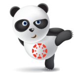
Course navigation was provided by modules three tiles and then the first use of the excellent HTML code – tabs (more on that shortly, a tweak from module two). You can review the embeddable content examples yourself with this word or caution – any embedded content has to pass your local filtering policy. Discussion forums offered a “swop-shop” style posting, with a handful of additional signposts, I quite liked the Edpuzzle (although there is not an LTi for Canvas) and due to the strict image filtering at school, I am hoping pixabay.com is open, or maybe pikwizard.com. Search panda and there is plenty to giant and other panda to choose from.

The “styling tweaks” are listed in easy, intermediate and advanced.
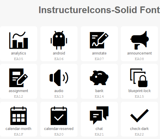
“Drop Capitals” were quite attractive and the “Content box” and “Shadow Text Box” clearly define important text. Access to an icon library useful.
“Alert buttons” added colour and “Button” the “Popups” added important interaction with the content and later on I learnt about “popovers.”
Maybe adding Horizontal Line Across the Page (controlling thickness and colour).
All very useful layout or visual signposts and hopefully, these can be added to the Canvas editor in time. However, the styling tweak I am most likely to use the regularly will be tabs. Just a little HTML code offers such improved use of the page estate.
There are a number of other Canvas “hacks” showcased on various Canvas pages – sortable content, announcement boxes and popovers for example. I also learnt that in Canvas “alert boxes” and “flash boxes”, success=green, alert=orange, error=red and information=blue. For now – I plan to keep it relatively simple for now.
Style tweaks wishlist – “return to top” and for the “Previous” and “Next” buttons be available at the top of the page?
My code notes from Gerol Petruzella’s course and other courses and Canvas guides.
Drop Caps
To add a fancy, elegant visual style to your paragraphs (while keeping your text and design accessible!), frame the first letter within your <p> with a <span> tag, as below:
<p><span style=”float: left; width: 0.7em; font-size: 400%; font-family: algerian, courier; line-height: 80%;”>I</span>n 65, Seneca was…</p>
Shadow Text Box
A shadow text box is a great way to add a little bit of visual flair and emphasis. It’s fairly easy to add the coding using the HTML Editor. You can also change the colors of the border and shadow by changing the background-color and solid line color.
Courtesy of James Henson, U of Alabama at Birmingham –
<div style=”margin: 50px 15% 50px 15%; background-color: #ccc;”>
<div style=”position: relative; top: -20px; left: -20px; padding: 20px; background: #fff; border: 2px solid #ccc;”>
<p>Lorem ipsum…</p>
</div>
</div>
Your text/content that you want inside the box goes between the <p> tags.</p>
Here it is again with a blue colour scheme.
<div style=”margin: 50px 15% 50px 15%; background-color: #0404B4;”>
<div style=”position: relative; top: -20px; left: -20px; padding: 20px; background: #58D3F7; border: 2px solid #0404B4;”><p>Your Text…</p>
</div>
</div>
Borders
Borders are a great way to section your content and emphasize titles. Adding the code is fairly simple in the HTML Editor. You place the code before and after the content you wish to place in the border. Borders can be used for text, pictures, video players, etc.
The code:
<div class=”content-box pad-box-mini border border-trbl”>
<p>some content here</p>
</div>
Alerts
Error: Sample .alert .alert-error style.
<!– Error –>
<p>
<div class=”alert alert-error”>
<strong>Error:</strong> Sample .alert .alert-error style.
</div>
</p>
Success: Sample .alert .alert-success style.
<!– Success –>
<p>
<div class=”alert alert-success”>
<strong>Success:</strong> Sample .alert .alert-success style.
</div>
</p>
Information: Sample .alert .alert-info style.
<!– Alert-info –>
<p>
<div class=”alert alert-info”>
<strong>Information:</strong> Sample .alert .alert-info style.
</div>
</p>
Buttons
Buttons are a way of creating interesting links within your course, rather than just using the standard hyperlink in blue text. Buttons can be linked to sections of your course, or you may have them link to external sites.
*Make sure to include the code within a <div> tag.
<div><button class=”Button” type=”button”>My Awesome Button</button></div>
There are different colors and styles of buttons that you can add. I’ve give some of the basic coding, but for more information, check out the Canvas Style Guide.
Popups (later pop-overs)
Another great interactive addition to your course is a popup. This allows you to have a button that retrieves a message. This is great for course information, or for instant feedback on something like a quick practice quiz or study tool. There are a lot of possibilities!
All you need to do is add the following code and keep your label and dialog within the correct <div> tags.
Like other buttons, you can also change the color depending on the style of button you choose.
<div id=”dialog_for_link1″ class=”enhanceable_content dialog”>Hard work at the start pays dividends at the end</div>
<p><a id=”link1″ class=”Button” href=”#dialog_for_link1″>Click to reveal the secret to success</a></p>
Icons
Iconx can be added to plain links or text in the course and may also be added to buttons. You’ll find the basic code below, but again, check out the icon library to change the icon to something more applicable to your course.
<a class=”icon-add” href=”whatever”>Add Stuff</a>
Tabs
<div class=”enhanceable_content tabs”>
<ul>
<li><a href=”#fragment-1″>PUT TITLE FOR TAB HERE</a></li>
<li><a href=”#fragment-2″>PUT TITLE FOR TAB HERE</a></li>
<li><a href=”#fragment-3″>PUT TITLE FOR TAB HERE</a></li>
</ul>
<div id=”fragment-1″>PUT THE CONTENT FOR THE FIRST TAB HERE</div>
<div id=”fragment-2″>PUT THE CONTENT FOR THE SECOND TAB HERE.</div>
<div id=”fragment-3″>PUT THE CONTENT FOR THE THIRD TAB HERE</div>
</div>
Popovers
Hover your cursor over the word “popovers” above, and see what happens! The textbox that will pop-up, will tell you what this example is all about – as will the blue “HTE” text in the following paragraph.
This has been placed in the Advanced module, because while this is a short and simple code snippet, it must be wrapped around the desired term in your text using the HTE which for non-coders can be tricky.
<a
data-tooltip='{“tooltipClass”:”popover popover-padded”, “position”:”right”}’
title=”Popovers are a word or line of text that when hovered over with a cursor, produces a pop-up text box with explanatory message”>
Popovers
</a>
Background colour
Change the background colour
<div class=”content-box pad-box-mini border border-trbl border-round” style=”background-color: #f2f2f2;”>
Background colour or a section
<div class=”content-box pad-box-mini border border-trbl border-round” style=”background-color: #f2f2f2; border: thin solid #ccc;”>Add text here</div>
Sortable Content
Box 3 – Click and Drag to Re-sort
Box 1 – Click and Drag to Re-sort
Box 2 – Click and Drag to Re-sort
Code Used for this Page
<div class=”enhanceable_content sortable” style=”display: none;”>
<div style=”text-align: center; background-color: #68838b; color: #ffffff; width: 300px; height: 50px;”>
<p style=”padding: 15px;”>Box 1 – Click and Drag to Re-sort</p>
</div>
<div style=”text-align: center; background-color: #50a6c2; color: #ffffff; width: 300px; height: 50px;”>
<p style=”padding: 15px;”>Box 2 – Click and Drag to Re-sort</p>
</div>
<div style=”text-align: center; background-color: #009acd; color: #ffffff; width: 300px; height: 50px;”>
<p style=”padding: 15px;”>Box 3 – Click and Drag to Re-sort</p>
</div>
</div>
[qrcode_display]